
Fresh & Friendly:
the wonder of color.
the wonder of color.
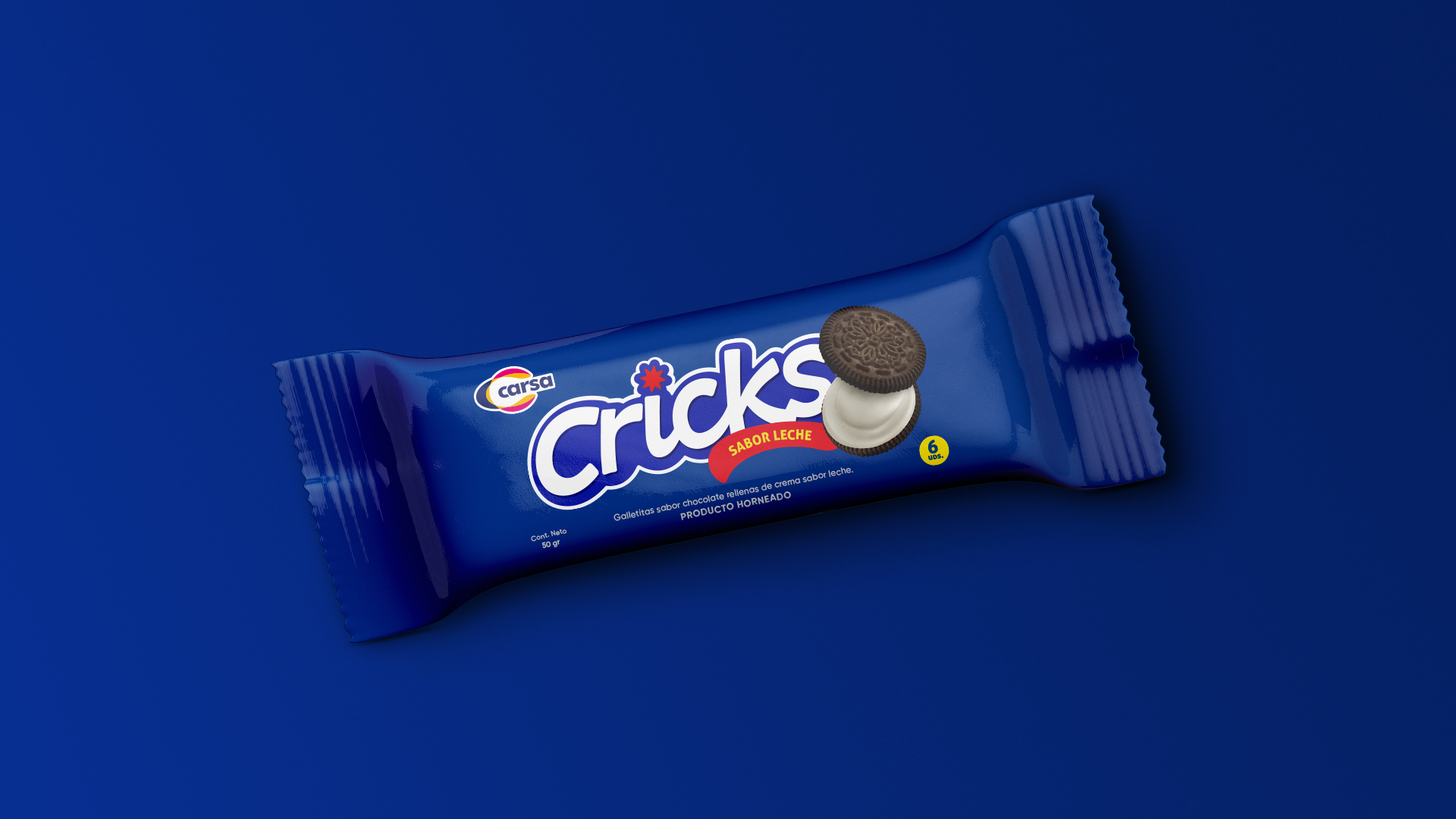
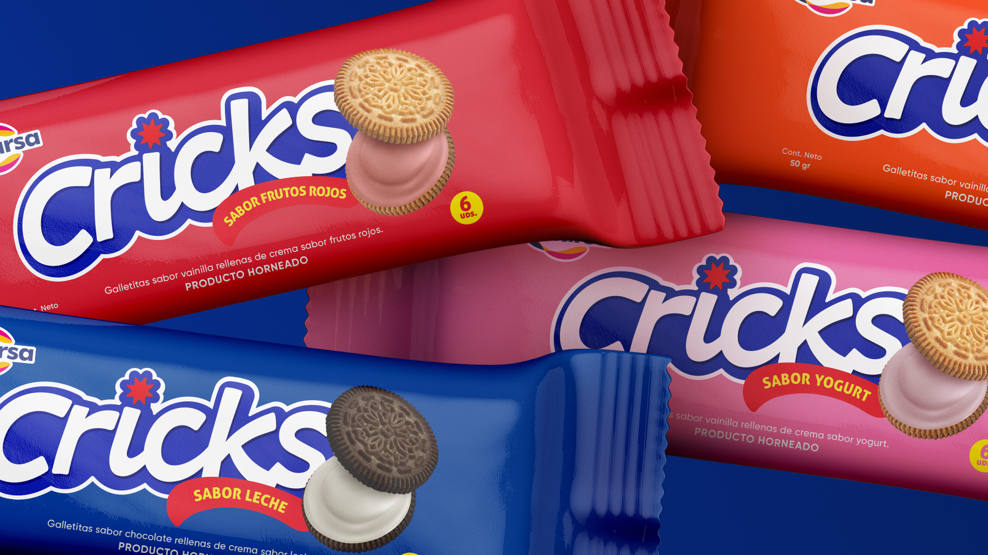
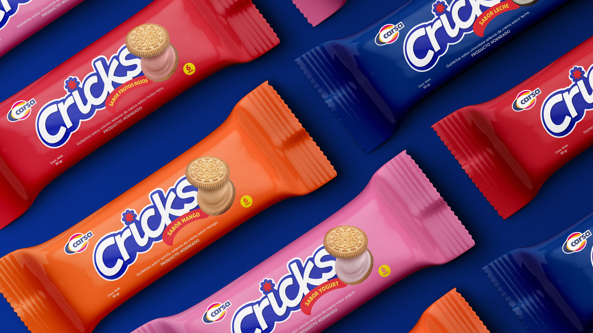
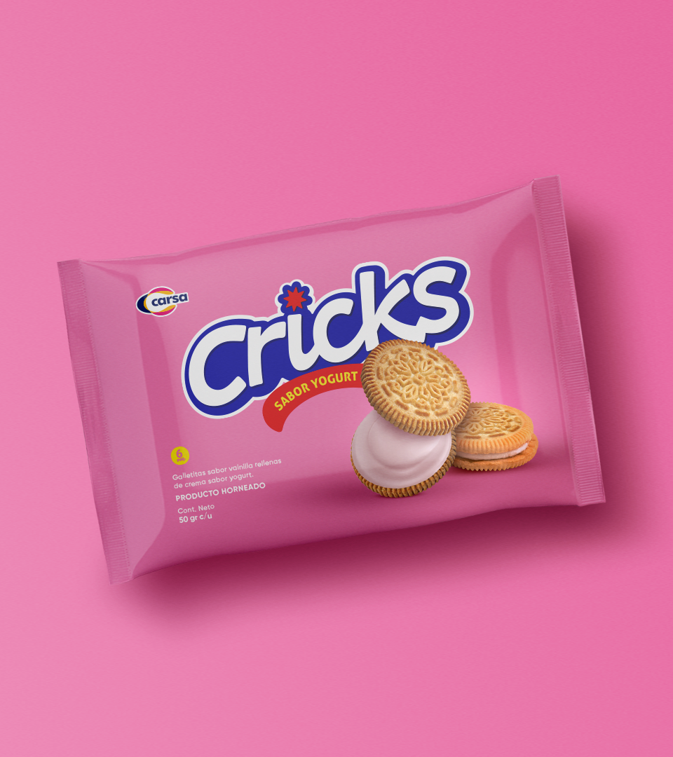
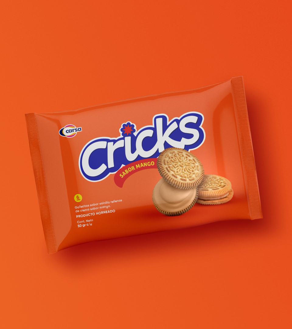
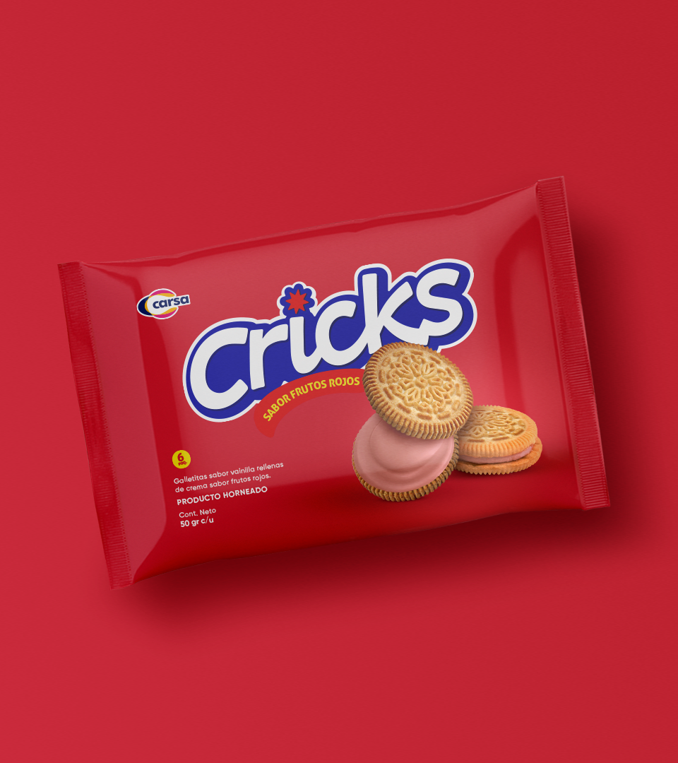
The Cricks redesign aims for a fresher, friendlier, and more appetizing appearance, intending to establish a direct connection with consumers. It's not just about a visual facelift; it signifies a move towards a more contemporary and straightforward brand.
We strategically played with vibrant colors to make a splash on supermarket and local store shelves, grabbing the attention of customers. The clean and stylish design complements this move, making the product easy to recognize quickly and efficiently.
To sum it up, the packaging redesign doesn't just make for a more attractive look; it tells the story of a lively and delicious brand, enhancing its presence in the market and deepening its connection with consumers.