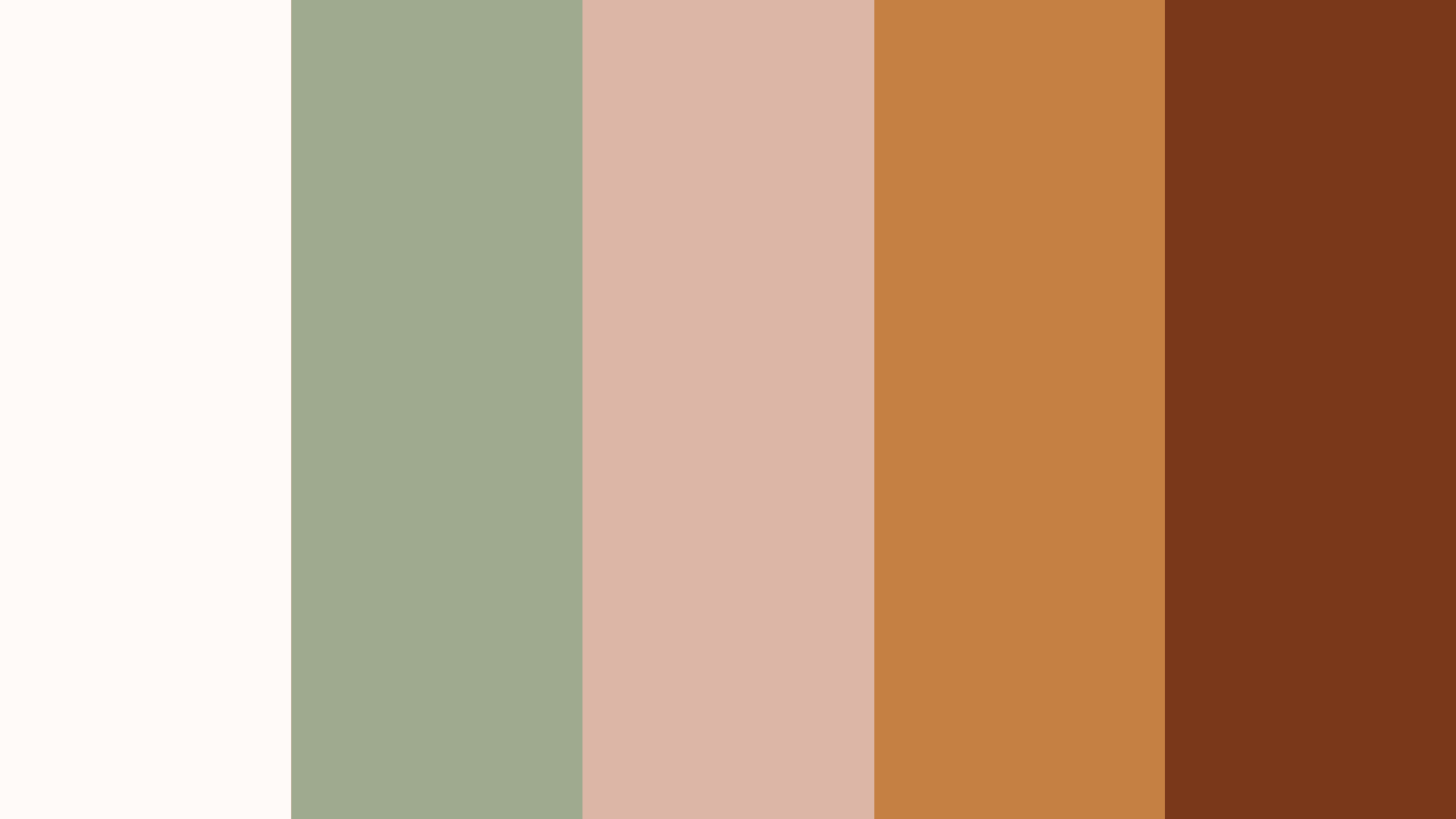
Hugging colors:
a safe place to be.
a safe place to be.
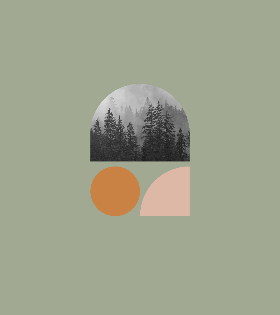
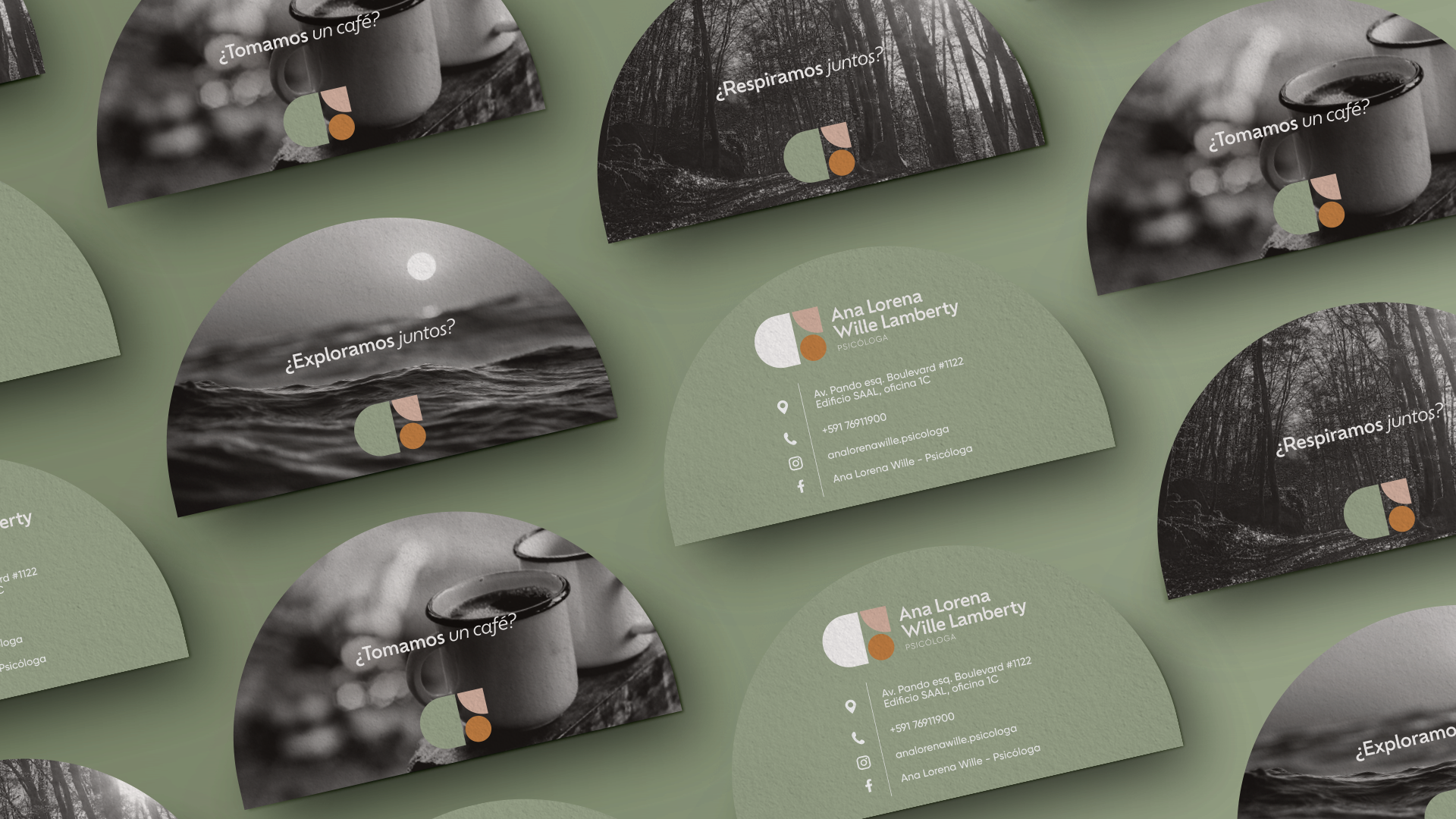
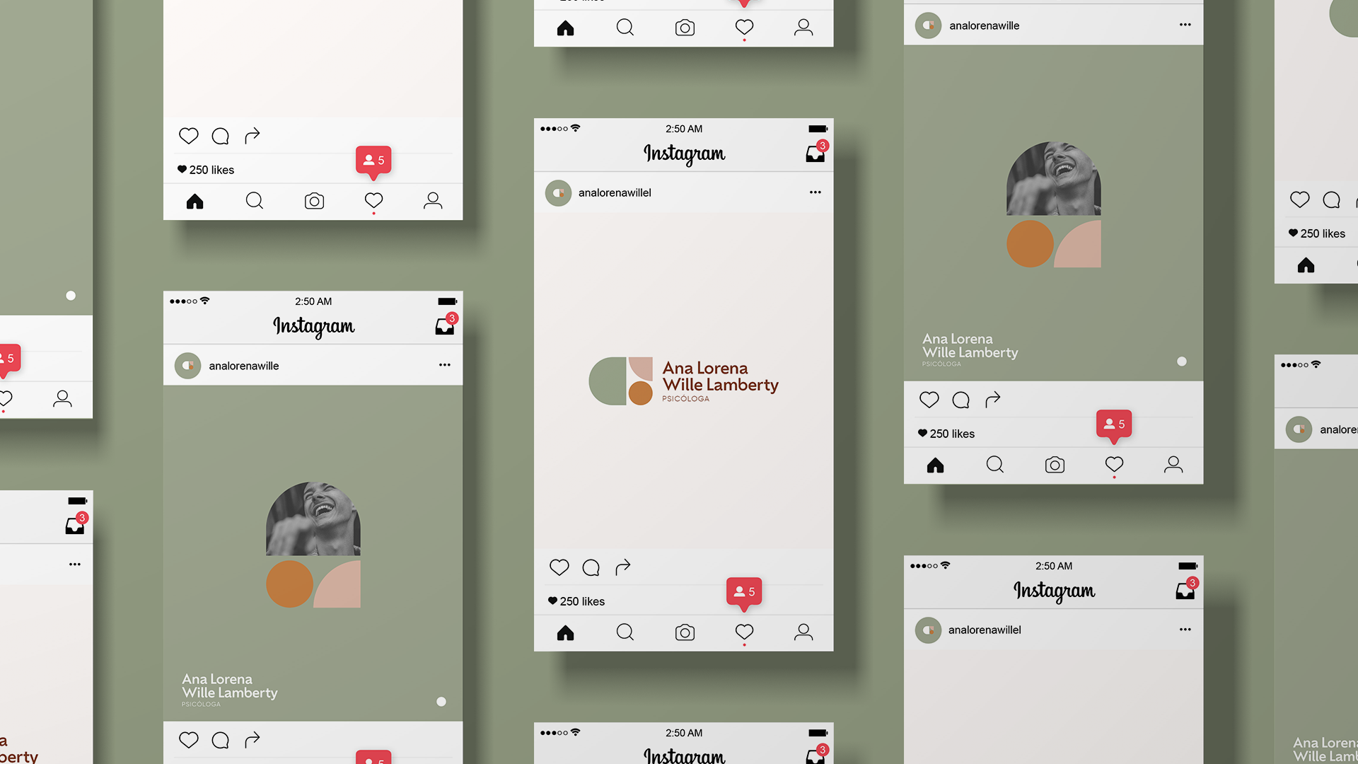
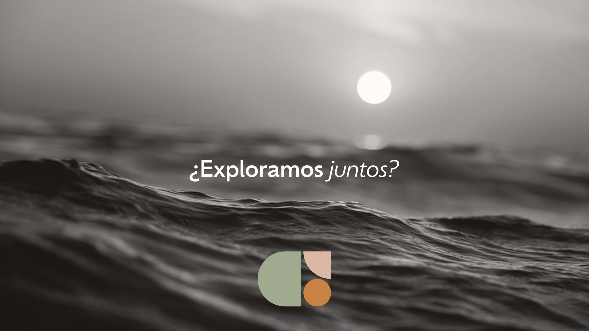
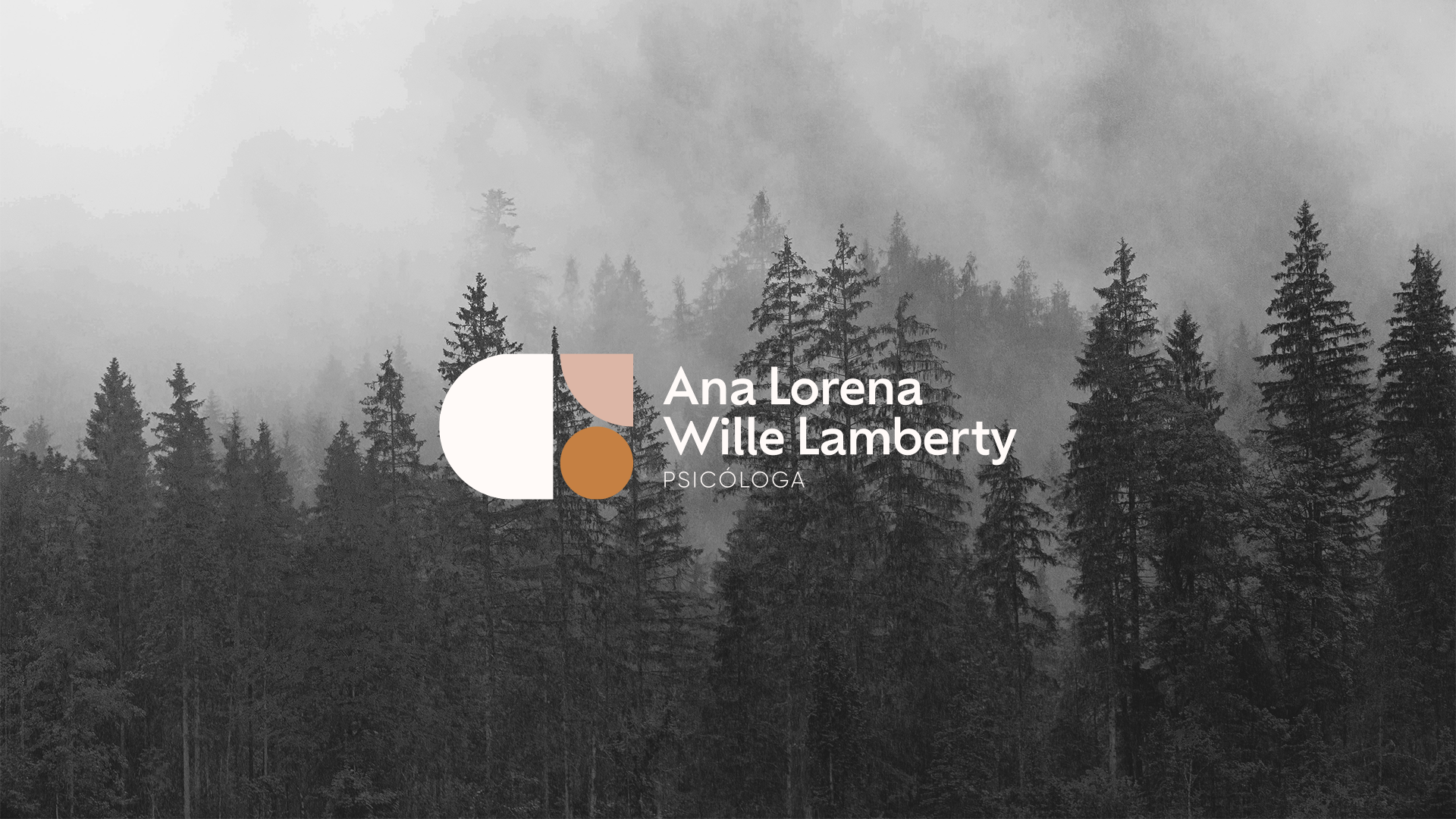
A graphic identity that blends modernity, warmth, and visual appeal. The brand, designed with a versatile icon, aims to create a personality-rich brand language.
The essence of the brand revolves around being close, warm, and harmonious; evoking trust, empathy, and sensitivity. The icon, composed of geometric figures, symbolizes the internal pieces that individuals explore and reconstruct during their personal growth journey. Guided by the professional psychologist, deconstruction is encouraged to rebuild and follow what nourishes the heart.
The terracotta color palette, warm and inviting, reflects nature, sensitivity, harmony, and self-love. Overall, this logo represents a therapeutic community with empathy, support, and striking visual appeal.